Aerial theme - moving over the description to sit under the add to cart buttons to help coversion
I've fed this back a number of times but now have evidence that doing this will help convert customers.
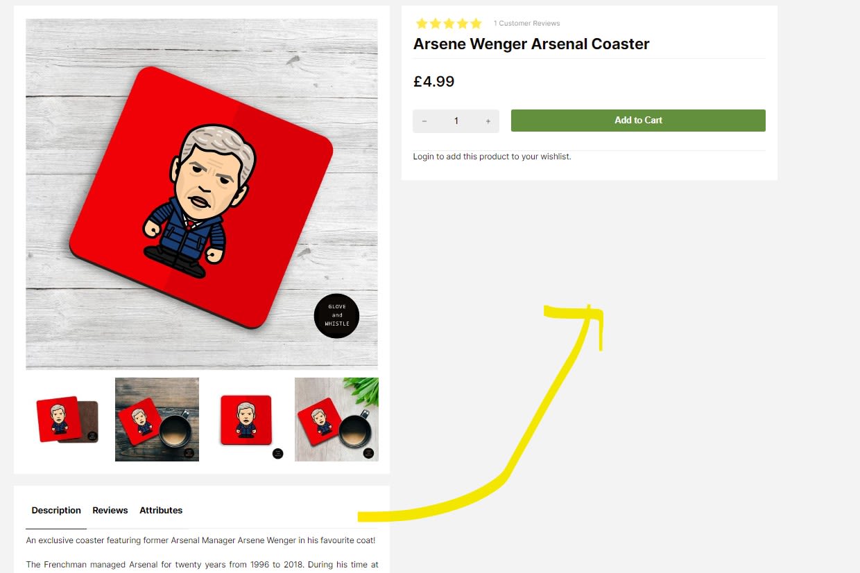
Heatmaps of where customers are looking when they visit a product page is very hot around the area that I think the product description should be on desktop.
Currently there is a huge white gap in this prime space on the arial theme.
The description should be on the right hand side, not o the left underneath all the images that on some browser you can't actually see without scrolling.
I've attached screen shots to show this.
Please upvote this so we can get this changed. Thank you.
Comments: 1
Oldest
•
Newest
•
Most likes
•
Fewest likes
-
14 Mar, '23
EKM MattYou can change this one yourself on the design tab :)
1) Go to the design tab and click Customise Theme
2) Change the Dropdown to the Product Page and click the Edit button on the Product Page section
3) Open the settings panel and change Design Selector to option Two.